

The song I received to create an LP jacket for was
Ballet mécanique by Antheil. The song, a classical song, was created during the 1920's and fit's it's era quite well due to the popular artistic styles at the time. The piece was originally composed to play as the soundtrack for a Dadaist film, but ultimately the two were not paired. The piece is highly reflective of the artistic style as it sounds cacophonous, chaotic, and nonsensical.
Research Board:

Page 1: I took a look at different LP jackets, the wild looking sheet music that pairs with the song, and other visual interpretations of cacophony using musical instruments.

Page 2: I took a closer look at dadaist art and the effects used and type faces used.

Page 3: I noticed that the majority of visual dada art consists of collage. So I looked at modern day art that uses this collage technique that I'll experiment incorporating into my final LP jacket.

I created a mind map for my LP jacket using the information I had collected on the song.

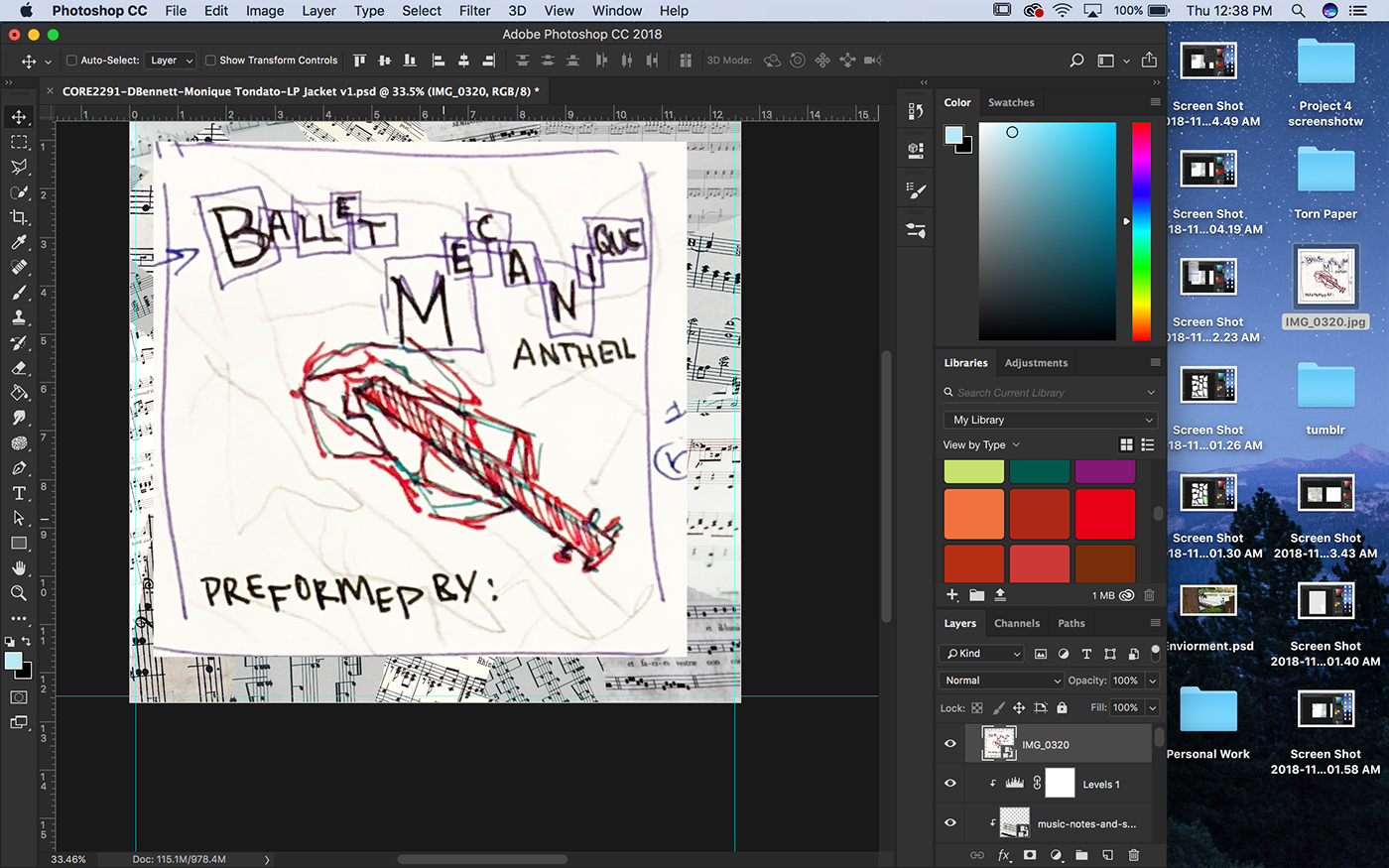
I created sketches, playing off that dada collage idea.

I decided to go with this design because I thought it best reflected the song. The LP will be made of Photoshop clipping masks with the torn pieces of paper in the background containing sheet music, and the violin in the foreground being made up of brown materials like cardboard, collaged together to create the shape.

To achieve the look I was going for I scanned in torn pieces of paper.

I used the magic wand tool to select the torn paper shapes.


Then I created the clipping mask! My goal was to capture the rough edge look of torn paper so I didn't worry too much about making it look perfect as a mask.

I would then place it into the file, find a good place for it, then embed one of the sheet music images I had collected, then I placed the sheet music into the mask that had been made.


Based on the saturation or brightness of an image I would adjust it under Brightness/Contrast or Hue and Saturation.

This step was repeated many many times.
I wanted to make sure I had the violin accurately depicted so I placed my sketch over the image, used the polygon select tool and created a mask to overlap with more torn paper shapes.

After that I placed more images to mask on warped torn paper, and used the same technique as I did with the sheet music to create the same effect with the violin, just with card board and brown paper.

I then found several images of different textures of red paper, which I masked out with the polygonal section tool, creating oddly shaped rectangles. I then placed in the title using Black Ariel, Athelas, and Georgia.

After finishing the type, I warped some pieces of paper to created a background for some more type and information.

I wanted to create a stamp like appearance of the test, so i typed it out in Illustrator and created outlines. I noticed the typos later, but luckily it was an easy fix.

I first went into Effect>Stylize>Inner Glow.


Then Effect>Pixelate>Mezzotint


Effect>Sketch>Stamp


Then I expanded the object so I could image trace.


Then I expanded the image one last time and brought it into the document on photoshop.

Then I added a color fill, which I clipping masked onto the type.


To make the back I copy and pasted the background of the first page, moved some of the shapes around, added a barcode, and added 2 sheets of the torn paper and placed a red paper clipping mask on them as a location where I would put my type.

I did the stamp effect once more on the title and added some type. I added a little bit of info on the composer and the orchestra.

I then added the logo for a music publishing company.

And their website and mailing info.

I was done with the covers!

All I had left to do was create a document in Indesign, combine the pages, and add an informational spine.

To create the sleeve I brought in the same background as I had been using, rotated it and moved many of the shapes around.

Then, I made it grayscale in photoshop.


I then brought in violins! I moved it around a bit to give it the appearance of a different string being played by the bow. Then I added my spot color in and viola!


To create the record, I placed down a near black color, and added a monochromatic noise filter on top of that.

A radial blur was added on top.

I then used the ellipse marquee tool to select a circle.

Which was the inversed and deleted.

I then added the cloud effect, which was radial blurred once again, the layer was placed into soft light mode, and opacity turned down.

Then I did some gradient trickery, copied and pasted it and turned it 90 degrees.

I lowered the opacity,

rotated it, then added two more circles in the center, one for the label and another for the hole in the center.

I then added my label art and had my final vinyl.


I assembled my work on the project board, showing off all the elements and deliverables.
Credits for the photos I used to accomplish this project:
Photo by Stefany Andrade on Unsplash
Photo by Jordan Mixson on Unsplash
Photo by Kwinten De Pauw on Unsplash
Photo by Nahir Giorgio on Unsplash
Photo by Ivan Gromov on Unsplash
Photo by Alexandra Gorn on Unsplash


